How to Perform Exploratory Data Analysis with Julius
This article will walk you through how to perform the essential steps in exploratory data analysis with Julius.
Introduction
To explore potential relationships between variables within a dataset, we can use what is called Exploratory Data Analysis (EDA). EDA is important as it helps to generate new insights and inform the researcher on the types of statistical analyses to be performed.
One might ask: what is the difference between descriptive statistics and EDA? Descriptive statistics and EDA are closely related, but serve different purposes in data analysis. The main difference is how much information each analysis provides. Whereas descriptive statistics provides a quick glimpse into the trends of your dataset (e.g. mean, median, mode, and standard deviation), EDA provides a more comprehensive view, as it usually involves looking at various graphical elements to further tease out trends.
Dataset Overview
A common dataset that is used to demonstrate how to properly run exploratory data analysis is the Titanic dataset. This dataset contains information about the passengers aboard the famous ship which sank in 1912 after colliding with an iceberg.
We will use Julius to help guide us through the process of performing EDA. Our goal of the analysis is to further our understanding of factors that may have contributed to survival rates, and to explore any other relationships between variables that may not be apparent at first glance.
Here is a preview of the dataset:
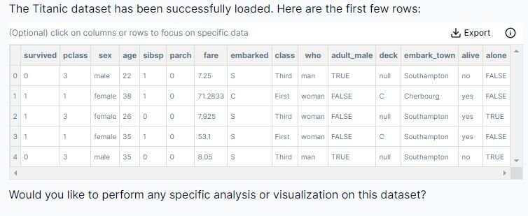
Below is a quick explanation of the meaning of each column:
I. survived (0 = no, 1 = yes)
II. pclass (passenger class with 1st, 2nd or 3rd class)
III. the sex
IV. age
V. sibsp (#of sibling or spouses aboard)
VI. parch (#of parents or children aboard)
VII. fare
VIII. embarked (where they were going)
IX. class
X. male/female
XI. adult_male (true or false)
XII. deck (where the passenger was located)
XIII. embarked_town
XIV. alive (if they survived)
XV. alone (if they were by themselves)
This dataset is accessed Python by executing the following code:

The dataset has 891 rows (N= 891) with 15 columns representing different measurements.
Step-by-Step Walkthrough
Step 1: Load in Dataset
Prompt: "Load the Titanic dataset"
This walkthrough will be done using Python, however you can also perform the analysis in Julius using R by switching the code runtime environment toggle in the top right of the chat interface
As previously mentioned, here is the code for loading the dataset in Python:

Step 2: Run Descriptive Statistics
The next step in any exploratory analysis is to perform descriptive statistics to get an understanding of the characteristics or trends. As alluded to earlier, the process involves getting an overview of the dataset by creating graphs, and calculating the distribution, central tendency, and variability for a dataset. Let’s prompt Julius to perform descriptive statistics on this dataset.
Prompt: “Please give me the descriptive statistics of the dataset using the following code:”

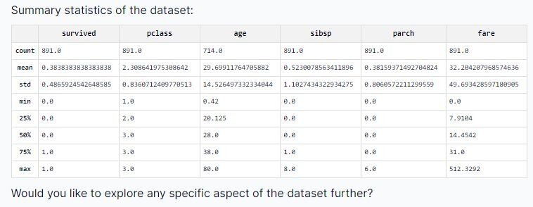
We can see the count (how many entries in the dataset), standard deviation (measure of how dispersed the data is from the mean value), the minimum and maximum values, and the 25%, 50%, and 75% interquartile ranges (measures of statistical dispersion). If you’re struggling to grasp the meaning of a statistic, I encourage you to ask Julius — one of the primary benefits of using an AI tool is the ability to ask questions and get easy-to-understand explanations in plain English.
Step 3: Data Cleaning
When looking at the “deck” column, we can see there are a couple of entries that are labeled as “NULL”.
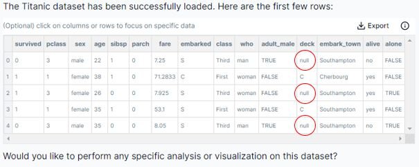
This will cause issues with some of our exploratory analysis, so it is best that we deal with this matter immediately. Let’s prompt Julius to scan the dataset for any additional missing values.
Prompt: “Check the columns for missing data please”
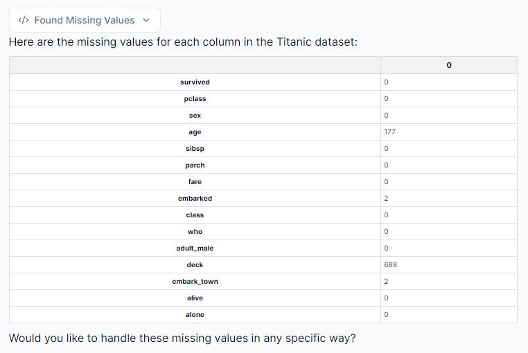
We can see that Julius has identified all columns with missing values. It looks like we have four columns to adjust for: age, embarked, deck and embarked_town.
Step 4: Addressing null values
To address the null or missing values from this dataset, we can do the following:
1. Fill missing values for ‘age’ with the median: The dataset is right skewed (which I’ll delve into later), so the median was chosen as it is more robust in dealing with outliers. However, be mindful that this may introduce some bias into our dataset.
2. Drop the rows with missing 'embarked’ values: There are only two rows with missing ’embarked' values, so this will not cause too much of an issue.
3. Drop the ‘deck’ column: Dropping the column completely is the correct choice, as it is missing too many values to be useful in our analysis.
Let’s prompt Julius to perform these actions, and then provide a preview of the transformed dataset!
Prompt: “Please remove the deck column, fill missing values for ‘age’ with the median age, and drop the rows with missing “embarked” values. Please show me a preview of the updated dataset once you are finished.”
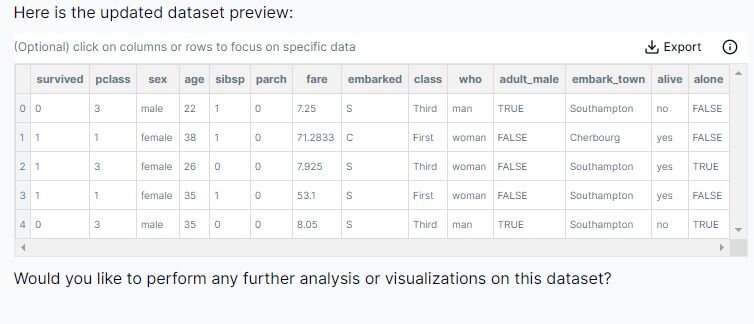
The above screenshot shows our updated dataset with the adjustments made by Julius.
Step 5: Creating a histogram of the distribution of age
To get an overall understanding of the age distribution on the Titanic, we can create a histogram, which should yield the following insights:
1. Which age group was most represented on the Titanic?
2. Which age group was least represented on the Titanic?
3. Is the data normally distributed?
4. Does the data show any skewness?
Prompt: “Let’s plot the age distribution on a histogram; please provide a skewness value associated with it, and explain what it means”
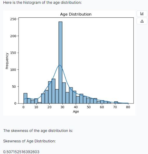
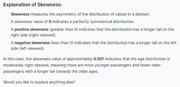
According to Julius we have a positive skew of approximately 0.507, which indicates our data is right-skewed, and may not be normally distributed. Additionally, from visual inspection, we can see that the age that has the highest frequency is around approximately 28 years of age. We can also determine that passengers falling within the late 70s to early 80s are least represented on the Titanic.
Step 6: Creating a bar graph on survival count by sex
Let’s create a graph to visualize the survival count by sex and see if we can identify any trends.
Prompt: “Let’s look at the survival count by sex”
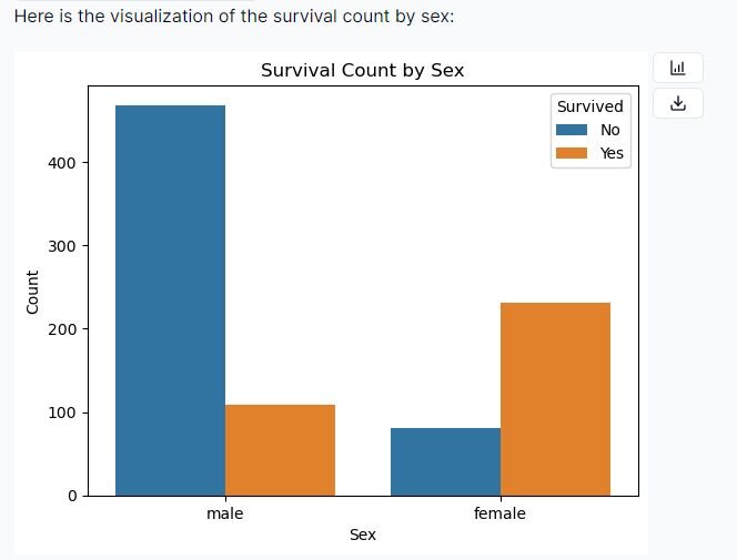
After examining this bar graph, we may be eager to conclude that females tended to show a higher survival rate than males. However, further research should be done to confirm these visual findings with statistical evidence.
Remember, the purpose of EDA is to get an initial idea of the trends in a dataset, and then to inspire hypotheses and corresponding statistical analyses to kickstart the statistical analysis process
Step 7: Creating a boxplot to visualize survival rate by fare
Let’s see if there are any interesting trends regarding the amount paid for fare versus survival rate. We can explore this by creating a boxplot visualization.
Prompt: “Create a boxplot that shows the fare paid by survival rate. Additionally, provide me with a correlation between fare and survival.”
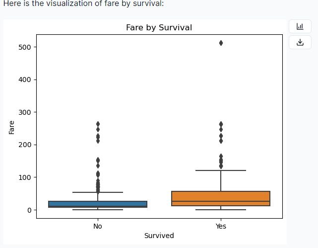
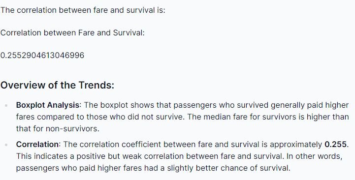
Examining both the boxplot and the correlation coefficient, we can identify a difference in survival rates between the passengers who paid a higher fare relative to the ones who paid a lower fare. However, further research and statistical analyses should be done to conclude this relationship.
Step 8: Exploring the relationship between embarking location and fare
Let’s now look at the relationship between the location a passenger embarked, and the fare paid.
Prompt: “Create a boxplot on the fare distribution by embarkation point, please.”
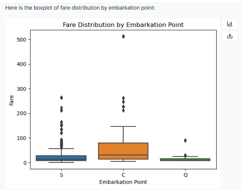
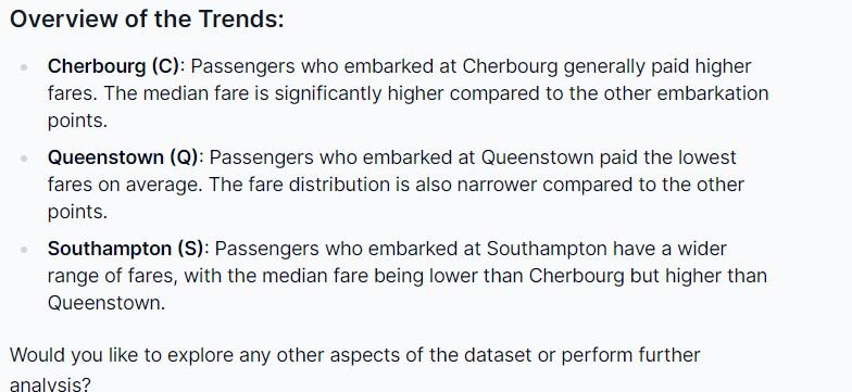
From this visualization, we can see the difference between fare prices in relation to points of embarkation. Passengers who embarked at Cherbourg generally paid the highest fare in comparison to the other points, while people traveling from Queenstown paid the lowest fare. You can also examine the outliers for each point of embarkation, and conclude that Southampton seems to have a wider distribution of fares paid by passengers.
Step 9 (Optional): Creating a new variable for your dataset
Note: this is an optional step to take if you are interested in how to instruct Julius to add in a new column to the original dataset. In this case, I wanted a new column that would record the family size for each passenger. This was done by summing the “sibsp” column with the “parch” column and then adding 1.
Prompt: “Create a new column called “family_size”; this is done by summing “sibsp” and “parch” then adding 1. Then calculate the average family size for me please.”
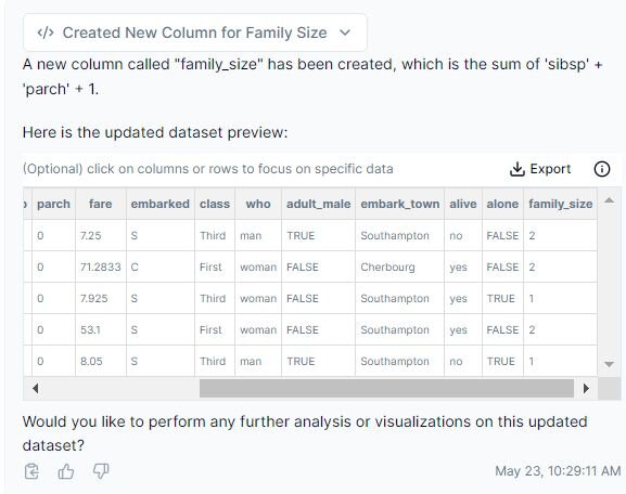
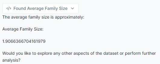
Using Julius, we have created a new column in our dataset called “family_size” and calculated the average family size, which happened to be approximately two people.
Conclusion
We now know how to successfully conduct exploratory data analysis with Julius, using the Titanic dataset. Throughout the walkthrough, we ran descriptive statistics, created various visualizations to identify potential relationships, and added a new variable to the dataset to further enhance our data exploration process.
Whether you are new to statistical analysis or a seasoned pro, Julius makes it easy to create visualizations, analyze trends, and explain concepts. Please feel free to explore other trends within this dataset to fully unlock the power of Julius in data visualization.
